Designing obsession: The book covers that brought art into the home
26 February 2015
As Penguin celebrates its 80th anniversary BRIAN MORTON examines its paperback designs and the artists who created them, along with cover art from successors such as Fontana, Picador and Paladin.
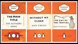
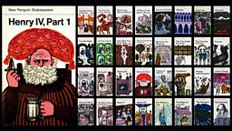
One of Penguin's greatest achievements was to make books that were collectable by ordinary people who could not afford fine bindings or esoteric limited editions. Founder Allen Lane and his brothers had a near-obsession with their design.
The publisher's most successful matrices make the books recognisable across a smoky club room or dusty hotel lounge. They were often devised by the company's brilliant chief designer Germano Facetti and developed by colleagues like Romek Marber, who created the grid for Penguin Crime.
Penguin used artists like Paul Hogarth, whose Graham Greene covers somehow define that slippery, uncertain world. Greene preferred imageless covers.

Penguin at 80
-
![]()
Designing obsession
The iconic book designs and the artists who created them
-
![]()
Spine tingling
Brian Morton looks back at the colourful history of Penguin
-
![]()
Translation matters
Anthea Bell on the value of translation in world literature


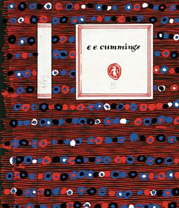
David Gentleman provided vivid images for Penguin's Shakespeare. Stephen Russ made beautiful cover patterns for the poetry series, while Alan Spain, Roger Mayne and others created a distinctive, almost solarised, look for Penguin Modern Poets.
Every series had its own collectable identity. The only slip-up came in 1967 when after art director Tony Godwin's departure, it was felt necessary to print "A PENGUIN BOOK" in heavy 36 point at the top of covers, as if anyone would have mistaken them for anything else.
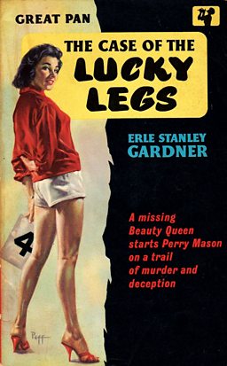
No other house had quite Penguin's confidence in design. Pan Books, which began publication a decade after, in the mid 40s, were defined by a Mervyn Peake colophon of the god playing his pipes, a hint perhaps that here was a house that wasn't going to trouble you with books on microeconomics or English churches, presented with Mel Calman or John Piper drawings, but with something more sensuous and possibly sensual.
The Lanes were not averse to paganism, but only at their parties. Pan covers were a titillating muddle, but they sold books.
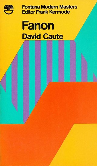
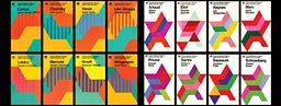
At the opposite extreme, but no less successful in their way, were the Fontana Modern Masters which began publication under Frank Kermode's editorship in the 1970s, combining seriousness, a quick-crib approach to major thinkers and a stunning simple visual device, which was that each group of books featured a tessellating cut-up of an abstract painting by Oliver Bevan.
Buy them all, lay them out on your table and you had a bit of modern art. Painterly abstraction and san-serif typeface seemed to go together and seemed to fit as well as Bevan's angles.
Oxford's Past Masters series struck a deliberately conservative and retrospective tone but never quite pulled off an effective rearguard.

Picador emerged as an imprint in 1972, offering international writing in a trade (larger) format with striking artwork.
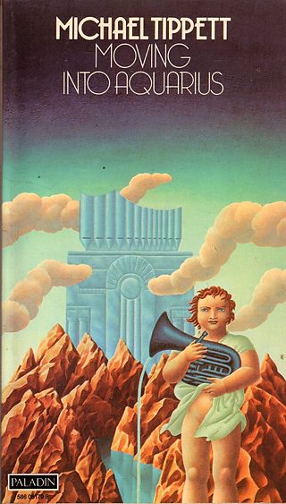
Paladin did likewise, with bright, bold illustrations, like Justin Todd's cover for composer Michael Tippett's trendy Moving Into Aquarius deliberately targeting the kind of audience that collected rock album covers as well as one that might listen to Radio 3.
But it was Penguin which continued to perfect the idea of cheap books as items that might be collected and displayed.
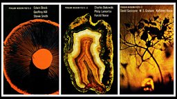
The Penguin Modern Classics series pioneered the use of modern art - sometimes taken well out of context - as a visual parallel to the book's content: Facetti put Francis Newton Souza's Two Saints In A Landscape on the cover of G. V. Desani's hilarious All About H. Hatterr, and Ben Shahn's Ambassador Satchmo drawings for the cover of Ralph Ellison's Invisible Man, a more probable association than the former but both of them effective.
For many, reading Penguins was also the beginning of an education in art history.