Judging books by their covers: Five publishing design cliches
9 March 2020
Eye-catching book covers have an important role in attracting readers to pick up a title – Hilary Mantel's latest was even beamed onto the Tower of London recently. But have you ever noticed that some designs seem strangely familiar? TOM CHURCHILL certainly has and he's mocked up five clichés that you're likely to spot on the bookshelves.
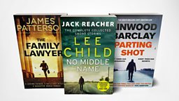
1. Bestselling airport novel
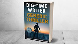
How it works
If there's one thing every self-respecting blockbuster novel needs on its cover, it's a silhouetted man with his back to the reader, walking away, alone.
It's a style that tells you, with all the subtlety of a sledgehammer, that the book's protagonist is likely to be a maverick who doesn't play by the rules and does things his own way.
Real-world examples include James Patterson (The Family Lawyer), Lee Child (just about any of his Jack Reacher series) and Linwood Barclay (Parting Shot).
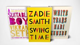
2. Heavyweight literary fiction
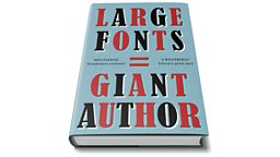
How it works
If you're courting broadsheet reviewers and prize judges with your latest slab of literary genius, you can't go wrong with big, bold, typography - if nothing else, it'll ensure that no one is in any doubt whatsoever who the author is.
It's a refined and classy look, eschewing generic stock photography and illustration in favour of a more abstract aesthetic. Bonus points if your title contains two words.
Some textbook examples come from Vikram Seth (A Suitable Boy), Zadie Smith (Swing Time) and Hari Kunzru (White Tears).
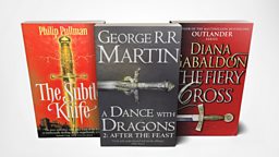
3. Fantasy epic
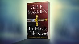
How it works
The sword is the go-to visual element for the Nth instalment of your long-running fantasy saga (other choices include shields, dragons, crowns, and single reptilian eyes).
It can be seen here to great effect in The Subtle Knife from Philip Pullman's His Dark Materials trilogy, George RR Martin's A Dance with Dragons, from the Game of Thrones series, and Diana Gabaldon's Outlander novel The Fiery Cross.
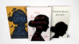
4. Female-orientated fiction
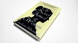
How it works
In case you were in any doubt as to whether publishers use cover design to target certain demographics, just look at how many books are adorned with a silhouetted woman's head, in profile, sporting a bun.
Whether it's magical fantasy (Kiran Millwood Hargrave's The Girl of Ink and Stars), a moving love story (The Story of Beautiful Girl by Rachel Simon) or even classic literature (Charlotte Brontë's Jane Eyre), this tried-and-tested design lets you know that this book is not for you, boys.
5. Gripping psychological thriller
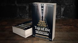
How it works
A staircase: check. Figure(s) walking up said staircase: check. The word 'lies': check. Yep, for the aspiring writer of 'gripping psychological thrillers' (incidentally, has anyone ever read a non-gripping psychological thriller?) there's only one way to go.
Expect dark family secrets, shocking forgotten events and big twists, aimed squarely at the Kindle audience.
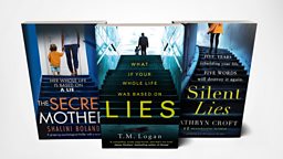
Our uncannily similar real-world examples come from Shalini Boland (The Secret Mother), T. M. Logan (Lies) and Kathryn Croft (Silent Lies).
Thanks to Covervault for the free Photoshop templates, and to photo-nic.co.uk nic, Heidi Sandstrom, Meireles Neto and Ricardo Cruz for the source photographs, via Unsplash.
A version of this article was originally published on 26 January 2018