Nine fun font facts that are more than meet the eye
How do fonts change the meaning of a message? What was Comic Sans invented for? Why was Obama's first election campaign so typographically bold? And which font would make you buy one chocolate bar over another?
From the formality of Times New Roman to the cuddle of Comic Sans, Michael Rosen discussed the psychology of typefaces with graphic designer and author Sarah Hyndman in Word of Mouth's Not My Type.
Here are nine fun font facts we learnt…
1. Round-shaped typefaces can make a jellybean taste sweeter, whilst an angular typeface can make the same sweet taste sourer.
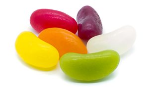
Round-shaped typefaces can make a jellybean taste sweeter
2. Your brain mistakes the reading process for what it’s reading about, so an easy-to-read typeface will likely convince you that your DIY furniture will be easier to assemble.
3. Some typefaces look more appetising than others; appealing to our desires with their curvaceous shapes, depth-of-flavour and their skill or artistry. These are also the styles associated with less healthy and more processed food options.
4. A harder-to-read typeface will feel like the task at hand will take more skill to complete. If this is a restaurant menu, you’re likely to assume that the chef is more skilful.
5. In Type Tasting surveys, styles like Didot with contrast, serifs and fine hairlines are rated as the most premium or expensive typefaces. Bold and rounded styles with little contrast are rated as looking the cheapest.
What did Obama's font say about his campaign?

Graphic designer Sarah Hyndman on Obama's typographically bold first election campaign.
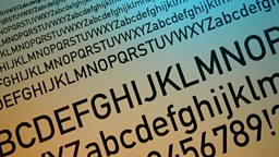
6. The first sans serif typefaces appeared in print in the early 1800s, around 140 years before Helvetica was designed. However they were ridiculed at the time for being ugly, and it was to be almost a century before sans serifs would come into regular use.
7. You trust a typeface depending on the context you see it in. Baskerville has been proven to be more believable than Helvetica or Comic Sans in an experiment with the New York Times, yet Helvetica is rated as the most trusted of the three on a road sign. Comic Sans scores as the most believable poster for a school party.
8. Type styles with large and circular lower case letters such as ‘o’ and ‘a’ are seen as being idealistic, optimistic and open. Examples are Lubalin Graph and Avant Garde.
9. In the 1800s display typefaces designed in London were given names like Egyptienne, Tuscan and Italienne, although their design had nothing to do with these locations. This was a marketing ploy because these were fashionable travel destinations.
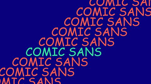
What was Comic Sans invented for?
Sarah Hyndman talks to Michael Rosen about how and why the Comic Sans font came about.


